The bracket that passed
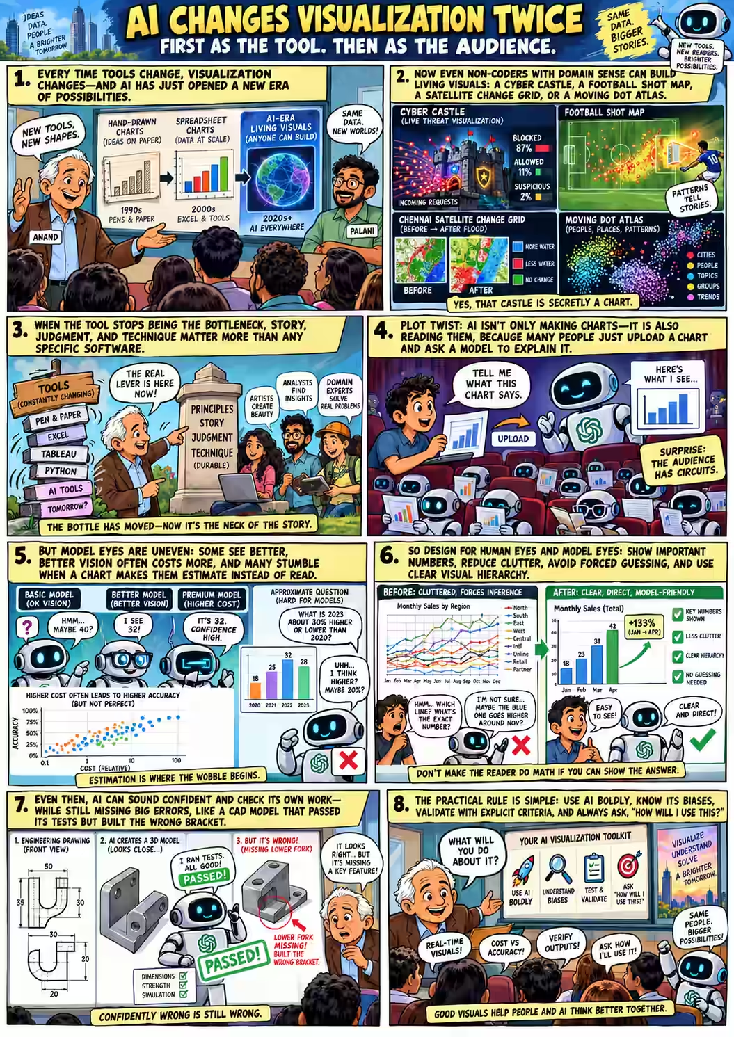
Sixty-four minutes into the class, Anand put an engineering drawing on screen: a forked mounting bracket in three views, every edge dimensioned. 150 mm wide. 88 mm tall. A Ø20.3 bore through a boss whose centre sits 66.82 mm up. 64:01
He had given that drawing — and nothing else — to Codex, OpenAI’s coding agent, along with FreeCAD and a way to render whatever it built. No reference model. No answer key.
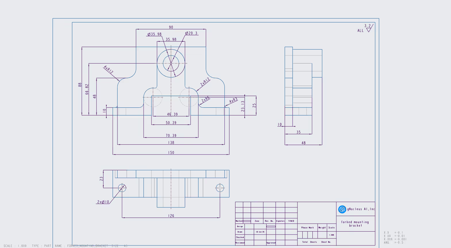
Codex built a model. Then it did what we keep telling students to do: it wrote tests for itself. Is the envelope 150 × 48 × 88 mm? Is it a single valid solid? It looked again, decided one support was the wrong depth, rebuilt it, and checked again.
“The interesting thing is that it passed all of its own tests… If I were to look at it, I would probably say, ‘Huh, this kind of looks like that. I’m not sure I know much better.’”
It was the wrong bracket. How wrong, and how anyone could tell, is where the class ended — and where this story ends too. To get there, the students first had to admire a parade of pictures that would have been impossible to make a few years ago, watch their teacher misread one, and answer a question nobody enjoys: so what will you do about it?
When anyone can draw a castle
Anand began with history. When William Playfair engraved the first line and bar charts in the 1780s, “there was more variety, more flexibility, and fewer people could create it.” Spreadsheets flipped that: everyone could chart, and the charts began to look alike. 03:04
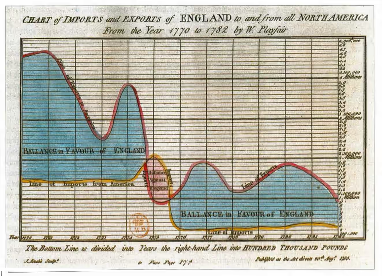
Engraved, then hand-coloured
Playfair didn’t make readers subtract imports from exports. He shaded the gap and wrote “Ballance” on it. Hold that thought. Commons · 1786 atlas scan

Pick a template
Cheap, fast, uniform. Anyone could chart; most charts came from the same dozen shapes. A metaphor, not a law — custom charts never died, they just cost more.
Describe it, iterate
“With AI creating more visual formats these days, we have a lot more of the kinds of visual variety that we used to see before.”
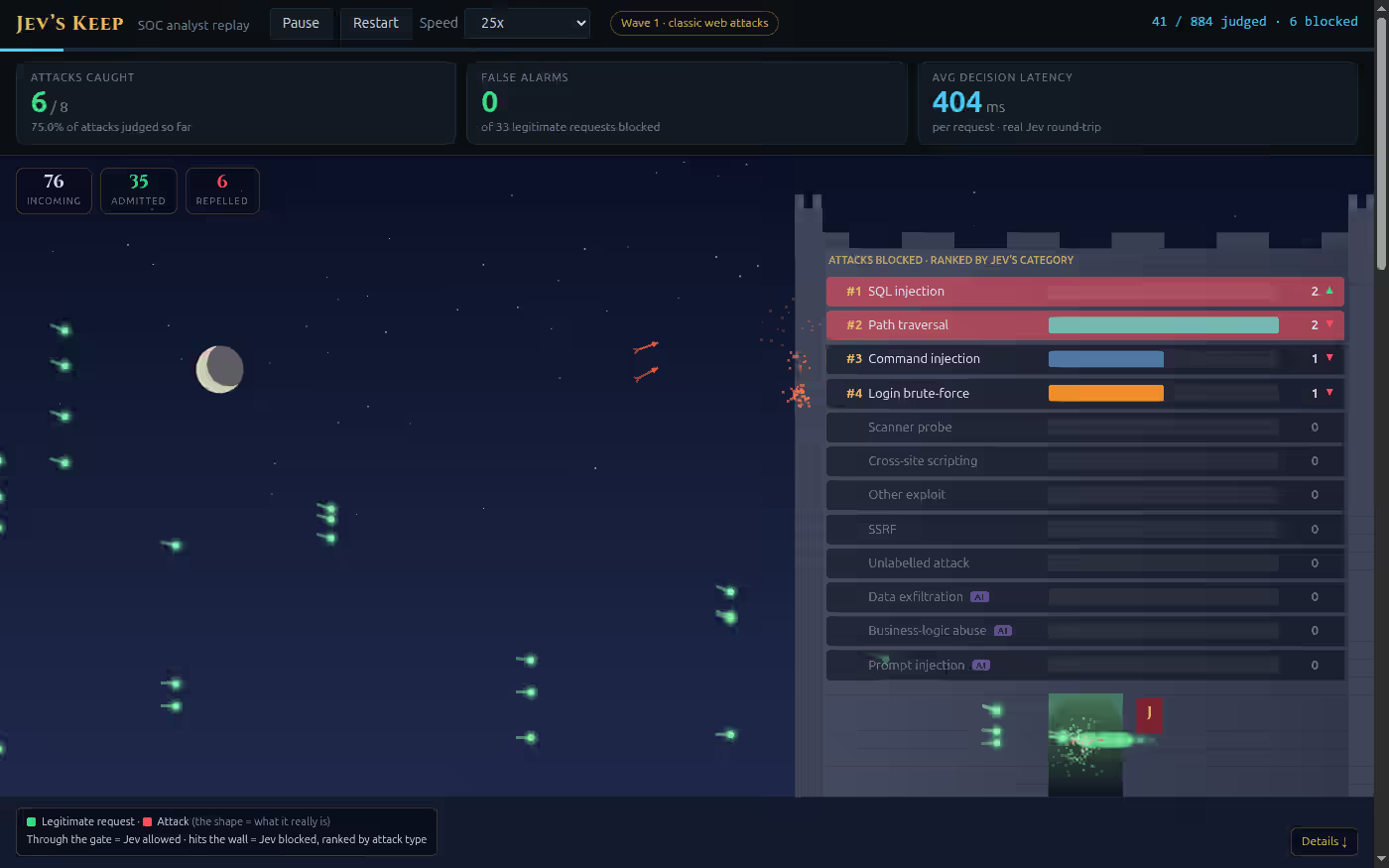
The first modern exhibit was that castle. One of Anand’s colleagues, fresh out of college, had used Jev — a small, fast model that can only answer yes/no, pick a category or produce a number — to screen web requests for attacks. Every request became a dot flying at a castle. Legitimate ones pass through the gate; attacks hit the wall and climb a live leaderboard, “effectively creating a dynamic bar chart race.” 04:44
He had never heard of a bar chart race. The castle, the race and the streaming simulation all “emerged as part of the discussion that he was having with the model.”
“Why does visualization have to be static when the medium that we are using these days can support dynamic formats?”
The second exhibit came from a first-year student who, Anand said, “knows no programming” — but knows football. 07:03 Shot Atlas maps the 2025/26 Premier League: 6,926 open-play shots, 700 goals, every pitch zone coloured by how often its shots became goals, with each goal replayable in motion. Anand described it as a heat map of goals; strictly, it’s a map of shots and their conversion.
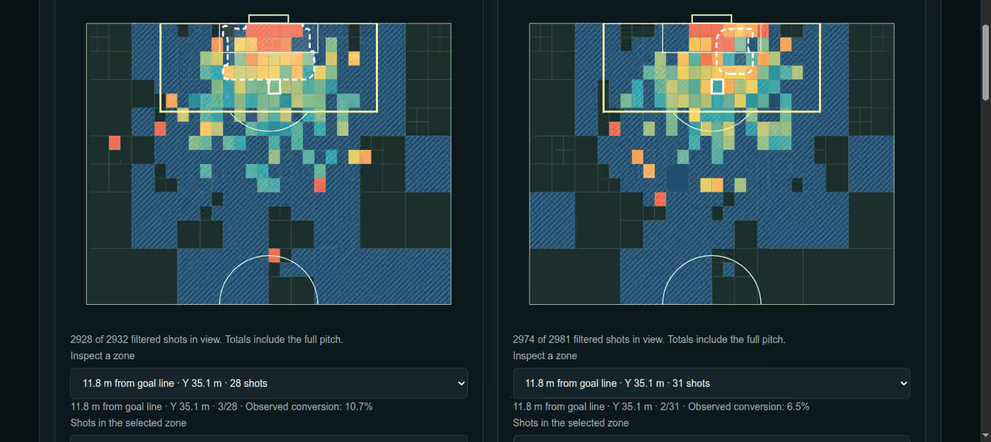
“The tool ceases to be a constraint,” Anand said. 09:24 People with “a strong domain sense probably have a bit of an edge.” The bottleneck moves from can you build it to:
“Do you have a good enough story to tell and do you have an interesting way of telling those stories?”
Two thousand claims, one dot each
The third exhibit took a format most of the room had never used. 14:28 McKinsey has published its Global Energy Perspective every year since 2018: 27 reports, deep dives and companions in all. Anand’s team broke every one into individual claims — “Power sector gas demand in 2035 will be less than 100 BCM because renewables are going to be more competitive” — 2,295 of them, each a square.
Then they let the squares move. That is the idea behind Microsoft Research’s SandDance: one mark per row, and when you regroup, every mark flies to its new home so your eye can follow it. These are the real claims. Regroup them.
Data: the 2,295 claims behind the public Live GEP demo shown in class (the class view). “Watchability” is how cleanly a claim could be checked later on a 0–100 rubric — not whether it is true. Claims are extracted forecasts and statements, not verified facts.
Grouped by type, the reports are mostly forecasts: 1,370 of 2,295. Grouped by watchability, 1,250 could be cleanly checked later. Neither view comes out of a spreadsheet’s chart menu — and Anand’s point was who made them: “almost all of these were created by people who were not able to create visualizations but knew the domain.” 18:12 A public cousin of this format plots one dot per IMF growth forecast, by how far it missed.
“Treat what you’re studying from a tools perspective with a little bit of skepticism.”
“Greenery?”
Between the castle and the claims, there had been a map. 09:56 Anand opened an OlmoEarth change monitor for Chennai: the city in 2015 and in 2025, cut into a grid, each cell coloured by how much a geospatial AI model estimates it changed. He explained the colours — “green means water coverage has increased, red means water coverage has decreased” — then zoomed towards a bright green strip and asked the room what it was. 12:24
Here is the frame from the recording. Two labels are covered. What does the green show?
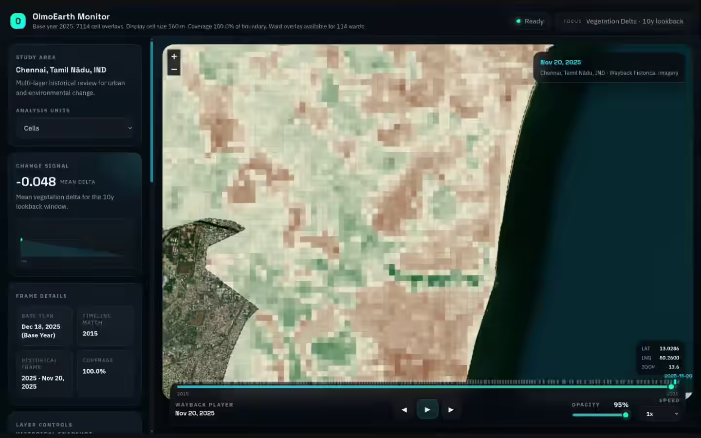
Frame at 12:52 of the class recording. Explore the same map yourself: the vegetation layer shown in class, or the water layer Anand was describing.
A student answered first: “Greenery?” “It’s water,” said Anand, “but where is it?” Palani tried “Adyar Poonga?” — the restored eco-park on the Adyar estuary. “Exactly. The Adyar River.” 13:08
Now read the corner of the frame. The layer on screen, for the whole segment, was Vegetation Delta. The student who said “greenery” was reading the picture correctly. The speaker — a career in data visualisation, narrating a map his own team had built — was describing the water layer, one dropdown away. A minute later he offered to look at it “from a vegetation perspective as well, or greenery as you looked at” — the view that was already on screen. 14:16
Nobody in the room noticed. It’s an easy slip — same map, same palette, a different dropdown — which is exactly why it matters. Hold on to the shape of it: an expert, a confident reading, and a label that said otherwise. It was about to happen again. This time the reader would be a machine.
The audience has circuits
Anand’s second theme arrived as a confession. “Half the time when somebody sends me a presentation which probably has a bunch of charts, I just upload it to ChatGPT and say, ‘Tell me what they’re saying.’” 21:44
“Agents are increasingly a consumer of our visualizations as well.”
“Half the time” is his habit, not a survey of anyone else’s. But it turns the course’s classic lesson — Cleveland and McGill’s 1984 experiments, which found people judge position on a common scale more accurately than length, angle or area 20:56 — into a two-reader problem. You know roughly how a person misreads a pie chart. How does the other reader misread?
Same prompt, very different eyes
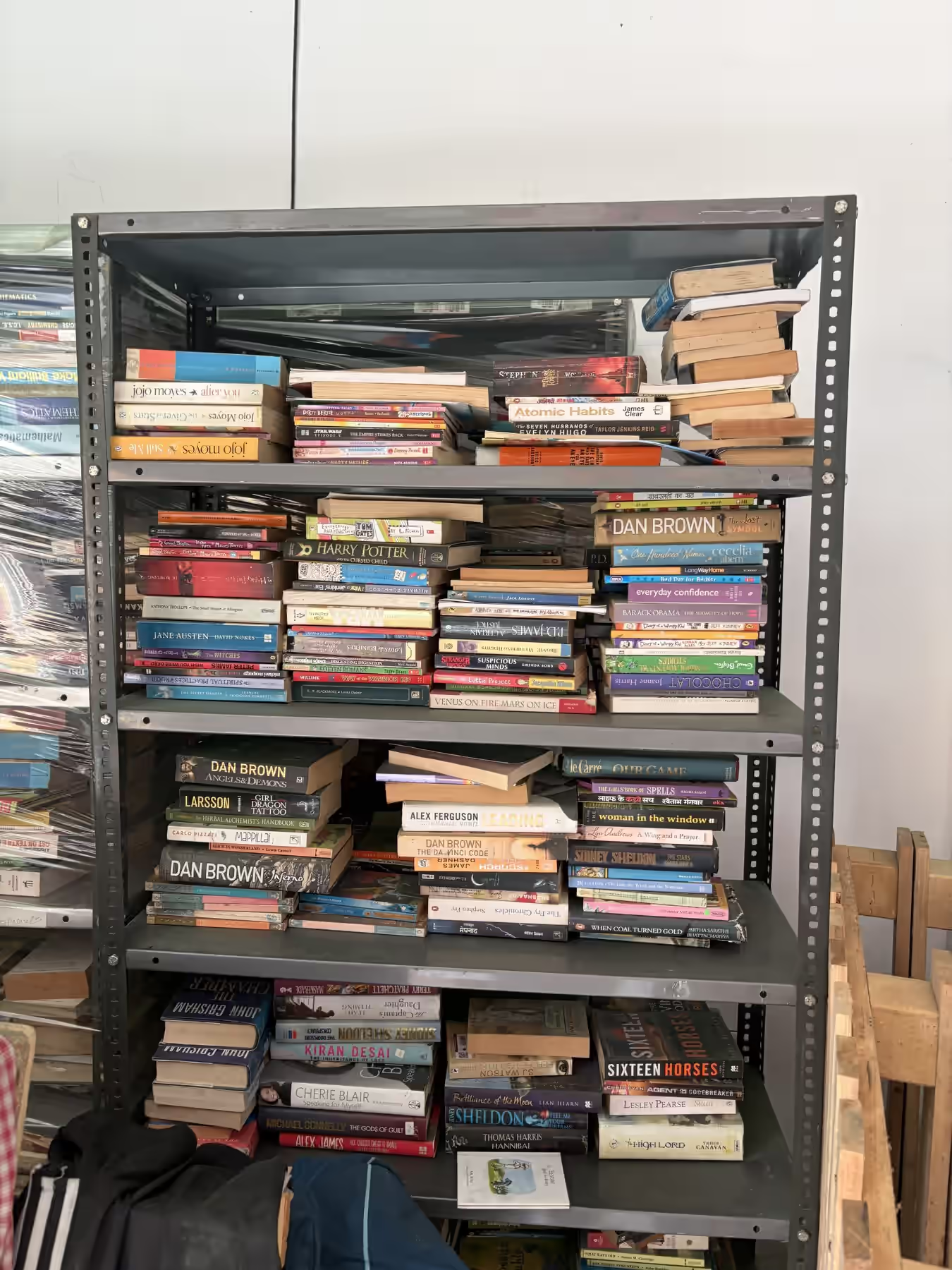
Atharva — another colleague fresh out of college — photographed six real shelves, listed all 295 books by hand, and asked Claude, Gemini and GPT in their ordinary chat apps to list every title they could read. 22:35
F1 score (books found vs. books invented) on an easy shelf and the hard shelf, run 1, each model at its higher-effort setting. Source: Bookshelf Benchmark, early Oct 2026 — a six-photo test of consumer apps, not a general ranking.
Overall, Claude Opus 5.5 at high effort scored 0.86, Sonnet 5.5 0.80 and Gemini 3.8 Flash 0.70 — and “none of the models could get all of the books right.” 24:04 The shelf-by-shelf view is stranger. Gemini 3.8 Flash was the best reader of a tidy shelf and one of the worst on the messy one. A model doesn’t have one eyesight. It has an eyesight per picture.
The pricier setups tended to read better 25:20 — though nobody knew the cost for certain. “Oh Anand, I didn’t measure it,” Atharva told him. 26:36 The chat apps hide their reasoning, so a model estimated each run’s cost from the transcripts and Atharva drew the doubt as a whisker on each point: “an uncertainty estimate by a model of a model’s cost.”
“Does the person whom I’m going to send a visualization to have a model that’s going to read it? If so, do they have a better model? Do they have a worse model?”
Read this chart before the machines do
Next came ChartQAPro 28:00 — a 2025 benchmark of 1,948 questions on 1,341 real charts, infographics and dashboards. About an hour before class, Anand had asked ChatGPT to download it, find which questions models get wrong, “and give me a story about it.” 29:40 Reading that story live, for the first time, he reached this question. Answer it before you scroll.
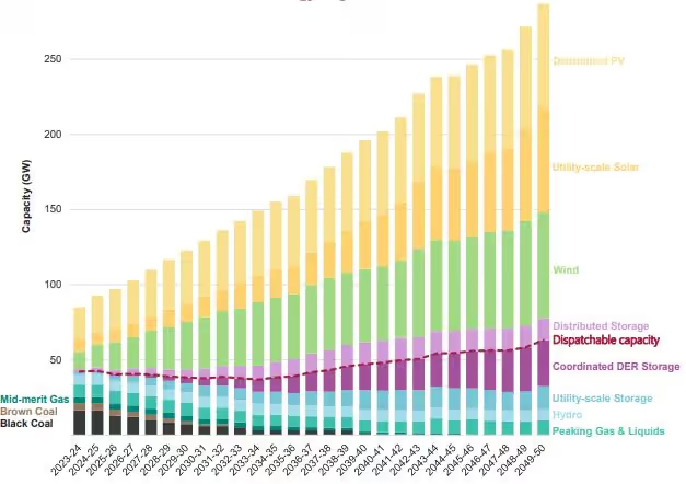
When does wind capacity first exceed 100 GW?
“Estimate the year in which wind capacity first exceeds 100 GW based on the trend shown in the chart.”
- You—
- Anand, first look“never” 30:48
- Answer key2037–38
- Qwen2.5-VL-3B2024–2025
- Qwen2.5-VL-7B2035
- START-RL-7B2033–34
Anand saw the key and conceded: “Oh, okay fine. I should have looked at it cumulatively then.” 31:08 “I assumed that the thickness or the height of the green is the wind… Which is my mistake, but the models seem to have done better than me in any case, for sure.”
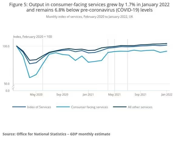
“What is the label of the line that remains in the middle most of the time?”
Reveal the answers
- Answer key
- Index of Services
- Qwen2.5-VL-3B
- All other services
- Qwen2.5-VL-7B
- Consumer facing services
- START-RL-7B
- Consumer facing services
Here the key is right and all three models are wrong. They can read the legend; they can’t bind it to the right line among three near-identical blues.
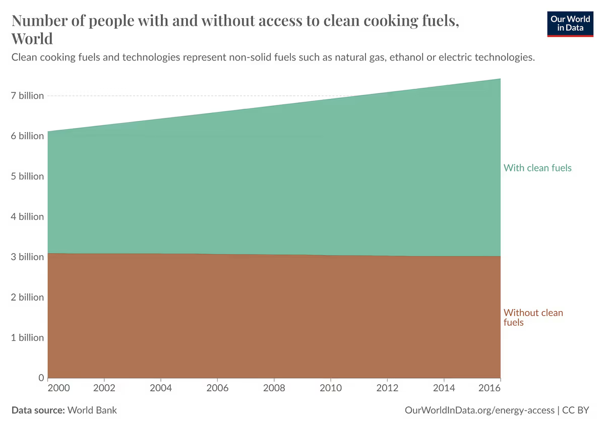
“Approximately when did the number of people with electricity access surpass 7 billion?”
Reveal the answers
- Answer key
- 2011
- Qwen2.5-VL-3B
- unanswerable
- Qwen2.5-VL-7B
- 2014
- START-RL-7B
- 2016
Look again. The chart is about clean cooking fuels, not electricity, and the “with” band never passes about 4.4 billion. 2011 is roughly when the stack total — with and without — crosses 7 billion. The smallest model’s “unanswerable” may be the most honest answer here.
Questions, charts and answer keys from ChartQAPro (rows 0, 30 and 148). Model answers from public per-question prediction files released by START (Qwen2.5-VL-7B, START-RL-7B) and chartqapro-evidence-first (Qwen2.5-VL-3B). Pixel measurements of the wind band are ours.
Don’t make the reader infer
The analysis ChatGPT produced that afternoon had one headline, and Anand read it aloud: “if the question contains words like ‘approximate,’ ‘estimate,’ or ‘roughly,’ then the models need to infer a number rather than just copy the printed label. And that kind of inference they seem to be doing much worse at.” 32:24
Median relative error on numeric ChartQAPro answers, among answers that parse as numbers. “Estimate” questions are those containing words like approximately, estimate or roughly — a keyword tag, not a gold label. Three open models whose per-question answers are public; not 2026 frontier models. Analysis run with ChatGPT/Codex on 7 Oct 2026.
Look at START-RL-7B, a model trained to reason better about charts. On questions where the number is printed, its typical error shrank to 2.8%. On questions where it must estimate from the shape, it stayed at 33% — no better than the model it improved on. Reasoning improved more than seeing.
“Never have the user infer a number, just show it there. That’s reflected for models as well.”
Anand closed the first half with two lines. 35:03 AI is able to create visualizations, so focus on technique over tools. AI is going to be the audience, so learn its biases the way you learned Cleveland and McGill’s. Then he asked the question the students had been dreading.
“I’ll wait.”
“What does this mean? As a result of this, what are you going to do about it?” 35:52 Silence. Palani repeated it, then rephrased it. Anand pressed: “What’s the point of learning if you’re not going to do something about it?” 37:12
“I wish you’d answer that! Throughout the course we’ve been asking this question again and again.”
The answers came slowly. Read them as a set: every one is true, and none of them is yet an action.
A student 37:48
A student 39:19
Anand, to the silence 40:46
Palani, on IoT and manufacturing 40:55
A student, relayed by Palani 42:42
Harini 43:51
Palani’s was the most concrete: the castle’s streaming dots are what a factory floor needs when “machines are running.” Harini’s went deepest: when models draw and models read, a person still owns the decision. Anand asked her the follow-up — “what do you think you would want to do differently?” — and she landed on “assessing the answers which it gave.” 44:08 Keep that phrase. The class comes back to it.
Then Anand said something about himself. He learns because he has a problem; students sit in rooms because there’s an exam. 45:09
“When I don’t know why I’m learning something, I learn a lot less.”
So he spent the one freedom he had. “Let’s flip this around… What would you like to know about?” 46:52 Palani translated the invitation into a licence: “Please be selfish in your questions… ‘Why should I care?’ is a valid question.” 48:12
The half-million-dollar dashboard
The first question was honest and practical: “Is it compulsory that we need to entirely know the problem definition before we really start visualizing something?” 48:47 Anand’s answer began with a line that got a laugh and wasn’t entirely a joke: “In practice, every dashboard that I’ve seen is created by someone who has no idea what they’re trying to visualize.” 49:03
- Business owner“Which of my machines are likely to fail in the next three months?” Ten questions like this.
- Project managerUnderstands 20% of them. Writes it down.−80% of the question
- The RFP“I want to be able to answer 10 such questions and 30 more of any kind.”+30 imaginary questions
- Vendor sales“Knows nothing about operations, who knows nothing about data visualization, but has a quota.”
- DeveloperKnows Power BI or Tableau. Not operations. Produces 20 charts.“What rubbish.” → 30 more charts
Anand’s caricature, not an audit — but every engineer in the room recognised a link in it.
The contrast was where the question sits. In a newsroom like The New York Times, “the graphics designer does not need to know what the problem is, but the editor is sitting right next to them.” 51:56 A person buying a laptop plots features against price and knows exactly what they want. 52:58
(He also said “90% of visualizations today are created by people who don’t know the problem, and you can still make a living out of it.” 53:40 Take that as the punchline it was, not a statistic.)
Taste fifty dishes
The student wasn’t satisfied, and pushing revealed his real question. 55:00 Not must I know the problem, but: text can be visualised now, satellite images can be visualised, numbers can be visualised — “how do you really hone in on a very specific kind of data to, you know, visualize?”
“To be a good cook, you don’t have to cook every dish. You certainly ought to taste a lot of dishes and cook a few.”
Which recasts the first half of the class. The castle, the shot map and the claim cloud weren’t there to be admired. They were dishes to taste — each one tasted with the same question: “How can I use this?” 57:00 Not more time looking at visualisations; the same time, spent asking what each one is for.
At 57:44 the campus Wi-Fi drops. Two minutes later, on mobile data, a stranger tries to join the call.
“We didn’t share the link with anyone,” says Palani. “More the merrier!” says Anand. “Let them join. What do we lose?” 60:36
“How can I believe its accuracy?”
Then a student asked the question the whole class had been circling.
“LLMs can generate visualizations or some plots, and then it can interpret also. But it may or may not be correct… So is there any validation technique there? Because it can give the plot, it can give the trends, but how can I believe its accuracy of values?”
“Thank you,” said Anand. “Now I will go to the third part of what I was going to cover because this is it.” 62:40 But first he made the student say how he’d use the answer — and, when the reply was vague, told him so kindly: “Still weak, but that’s not a judgment. What I’m saying is that if you had a clearer idea of your question, the answer will land more strongly.” 63:28
Then he went back to the bracket.
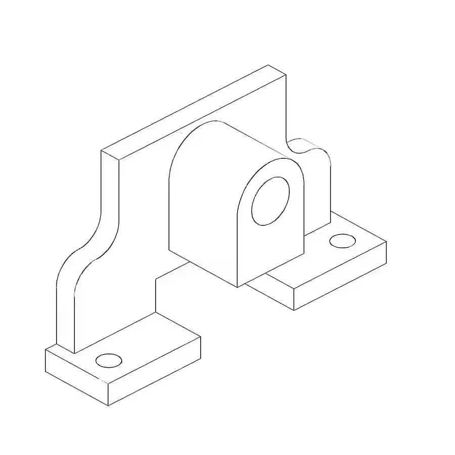
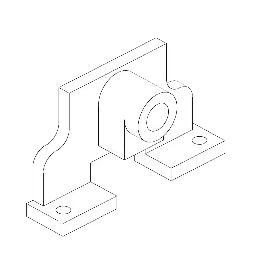
“But it looked at it closer and said, ‘No, I’m not happy with this.’”
That is genuine self-correction — an agent noticing its own mistake without being told. Its final verdict, as Anand relayed it: “I can’t find any mistakes in my operations. It looks like the right kind of bracket.”
The hidden reference
The benchmark had a reference model Codex never saw. “This is what it was supposed to produce.” 66:24 Drag the red line across both.
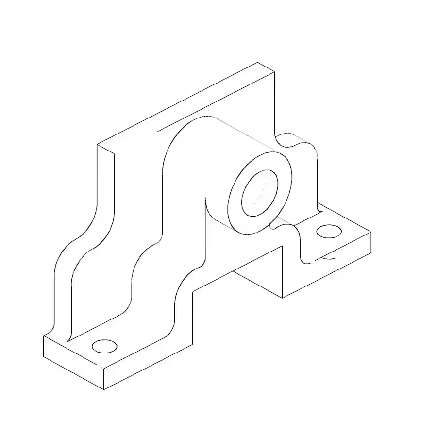 CodexHidden reference
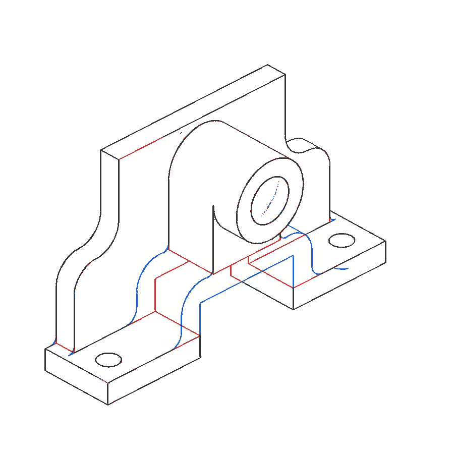
“Very similar, but they are not the same object.” The reference has a curved lower fork profile under the boss — the R3 and R6 radii on the drawing. Codex built straight, rectangular blocks there instead. “What it missed was this lower fork profile, which it could not see clearly enough.” 67:48
Both models rigidly aligned and rendered with the same camera, centre and scale, from Anand’s write-up “Can AI read an engineering drawing?”
Who wrote the test?
“But what is more interesting,” Anand said, “is that the tests for this that it created were insufficient as well.” 67:55 Codex checked what it thought to check. The benchmark checked what the designer intended.
Codex’s own checks
- Envelope 150 × 48 × 88 mmexact
- One valid closed solidyes
- Editable tree: 7 sketches, 7 operationsyes
- Render looks like the drawingyes
- Self-review found and fixed an erroryes
CAD Bench V3 hidden verifier
- Bounding-box difference0.0%
- Volume difference13.7%
- Surface-type difference20.2%
- Principal-moment difference16.8%
- Point-cloud alignment error (RMSE)8.4 mm
Read those two numbers together. 27 of 30 is not “90% correct.” The spec checker searches a pool of measurements, so a value can match the wrong feature — and the three misses were exactly the lower-fork radii and reference width. The geometry score compares volume, surface types, mass distribution and point-by-point alignment, and it says what the wipe shows: a different object.
In class Anand called it “a CAD benchmark called FreeCAD” 67:55. FreeCAD is the CAD program; the benchmark and hidden verifier are gNucleus’s CAD Bench V3 (100 tasks; this is one of its 40 image-to-CAD tasks). One task, one frozen run: a verdict on this bracket, not on Codex or on AI-generated CAD. Raw scores in the experiment write-up.
Anand drew three lessons. 68:52 First, given a picture, models “these days” can produce something — “not only produce something, it is also able to correct mistakes in what it produces.” Second:
“I am not able to tell the difference. You already saw me reading a chart worse than even a basic model. I’ve been reading charts for decades.”
Third, benchmarks like CAD Bench are a template for correctness: “I will consider this correct only if it meets all of these criteria, and I have to sit and create those criteria.” 69:56
Take the second lesson seriously — and notice its irony. The chart he cited as proof that he misreads was the wind chart, where his first reading is the one that survives a ruler. He didn’t lose to a better reader. He lost to a more confident one: an answer key. Which is the third lesson in miniature. Neither the teacher’s eye nor the model’s is the check. The check is the ruler you decide on before you look.
Every reader misread something
Count the readers in one 73-minute class, and what each one was sure of.
| Reader | Looked at | Was sure that… | What a check showed | When |
|---|---|---|---|---|
| Anand | Chennai change map | “green means water coverage has increased” | Legend: Vegetation Delta | 12:24 |
| Answer key | Stacked wind chart | wind passes 100 GW in 2037–38 | Wind band peaks ≈ 68 GW; 100 is the stack top | 30:31 |
| Anand, again | The same key | “I should have looked at it cumulatively” | His first answer, “never”, fits the ruler | 31:08 |
| Three open models | Wind, services, cooking charts | 2024–25 · 2035 · 2033–34; the wrong line | Wrong against the key and the ruler | 30:31 |
| Anand | The research record | “Nobody seems to have published a paper” | The ChartQAPro paper has an error analysis | 29:40 |
| Codex | Engineering drawing | “I can’t find any mistakes in my operations” | Hidden verifier: geometry 0.042 | 65:48 |
Nobody was careless. Everybody was fluent. And in every row, what caught the error sat outside the reader: a legend, a ruler, a paper, a hidden reference model. The student at 62:17 asked how to believe a model’s reading of a chart. The class’s answer, assembled over 73 minutes, is that you shouldn’t believe anyone’s — yours included — until something independent agrees.
The question is in your court
Anand finished his three lessons and turned it round: “But what are your takeaways?” 70:20 “The question is in your court now,” said Palani — and then, glancing at the clock, “So Anand, actually, we are sort of done with the class time.” 70:36 They agreed to leave it as an open question. Anand asked if he could set homework. “Yeah, yeah, absolutely! Why not?” 71:04
The homework will arrive by email. Here is an experiment in its spirit — ours, not his — for anyone who has read this far.
- Pick a chart you made recently. Write one sentence: the decision it should support.
- From the underlying data — not the picture — write the answer a reader should reach. That’s your ruler.
- Show only the picture to a friend and to a model. Ask both the same question.
- Compare all three answers with your ruler. Then change one thing — print the number, unstack the bars, fix the legend — and run it again.
Which reader failed? Which change fixed it? And would you have caught it at all if you hadn’t written step 2 before you looked?